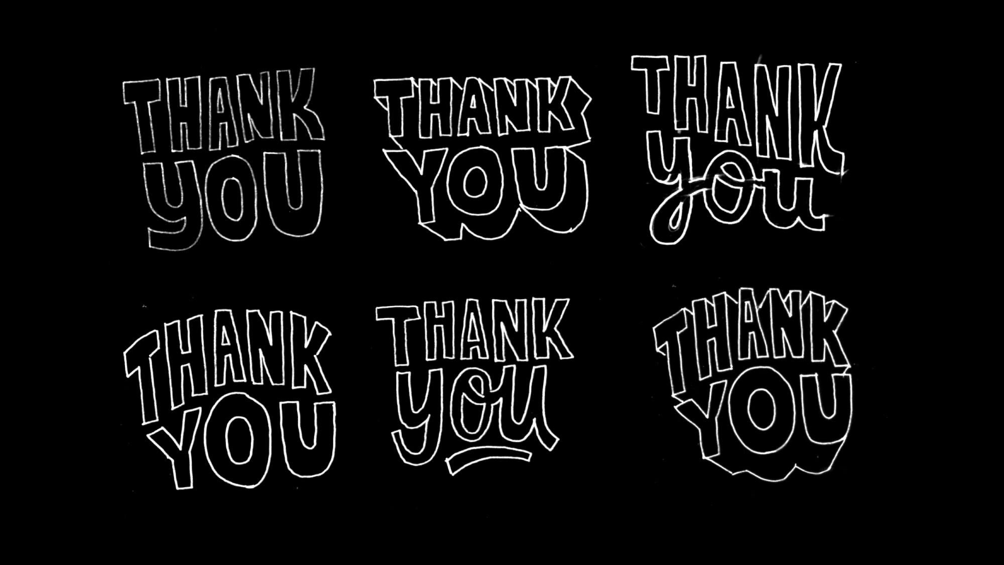
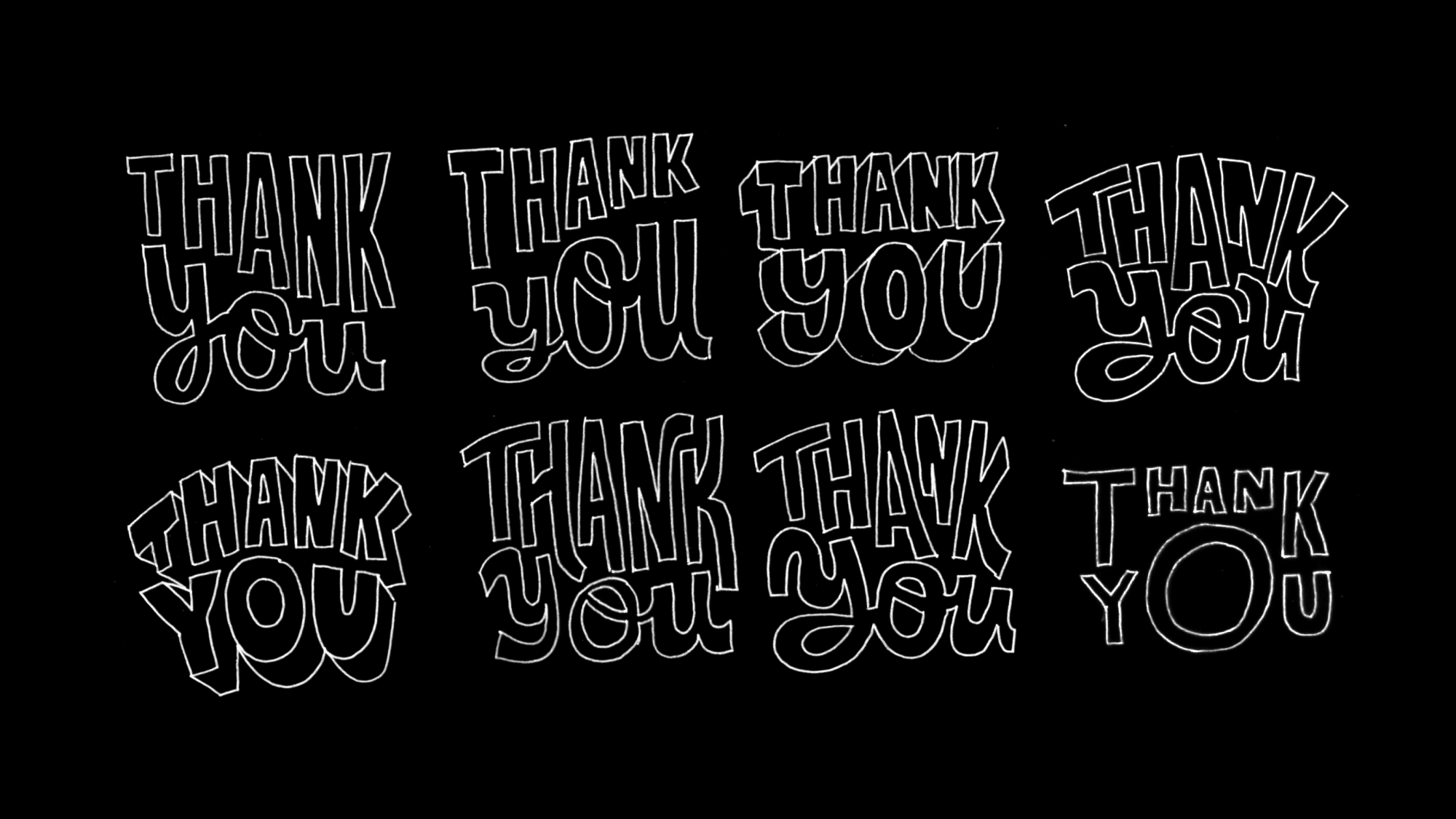
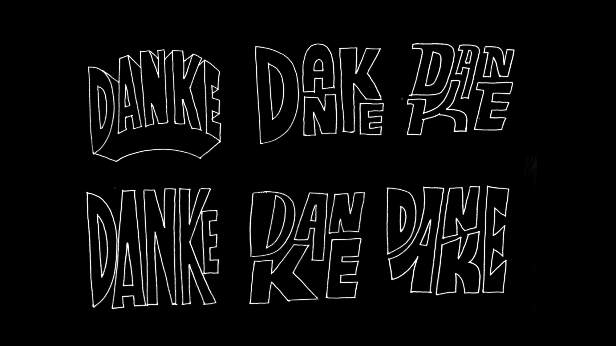
Slack Gratitude
Emoji Pack
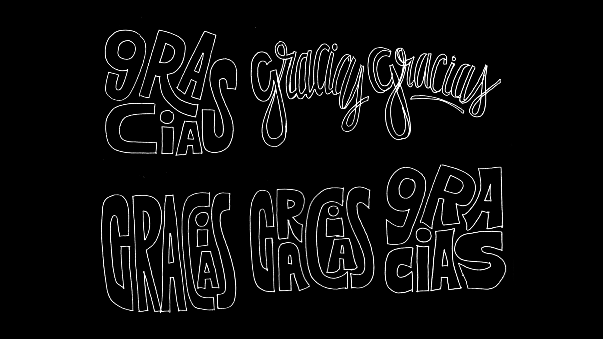
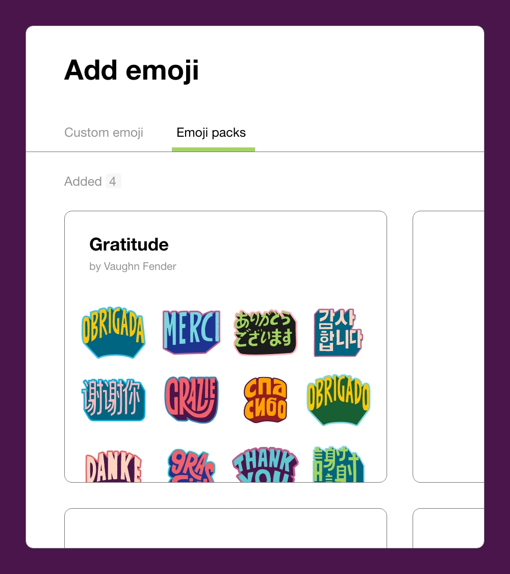
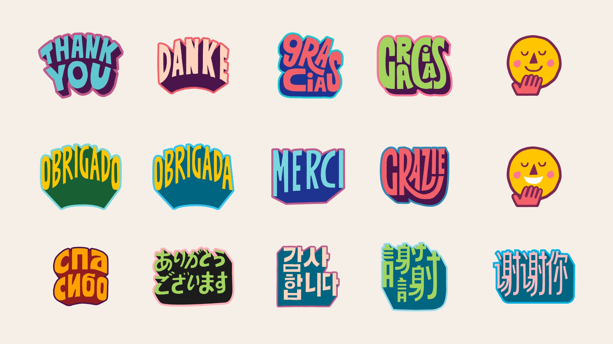
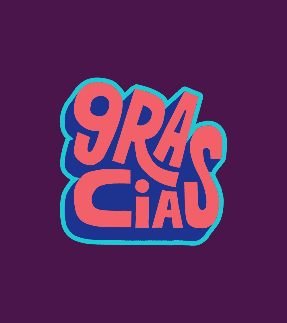
Slack is by far one of the most popular instant messaging work tools around. Within the slack ecosystem are varying emojis used to express simple, nuanced and complex emotions. The Slack team pushes to create an experience beyond the norm by creating custom emojis for the platform, working with different artists. How many ways are there to say “Thank You”? I was brought in to create the Gratitude emoji pack - highlighting “Thank You” in multiple languages.
Agency: MadeOffline
Role: Lettering, Illustration
Agency: MadeOffline
Role: Lettering, Illustration


Prudential
Retirement
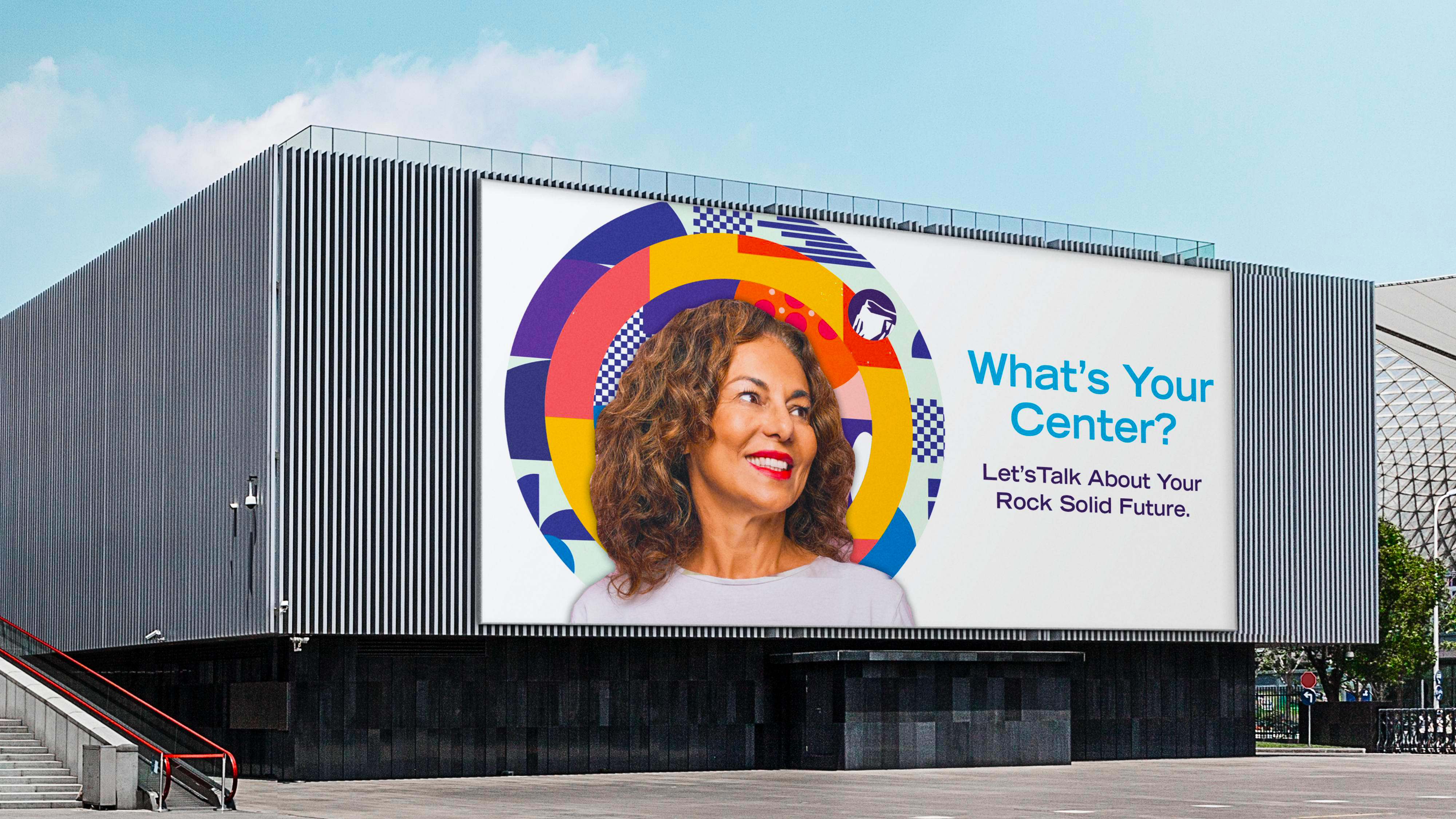
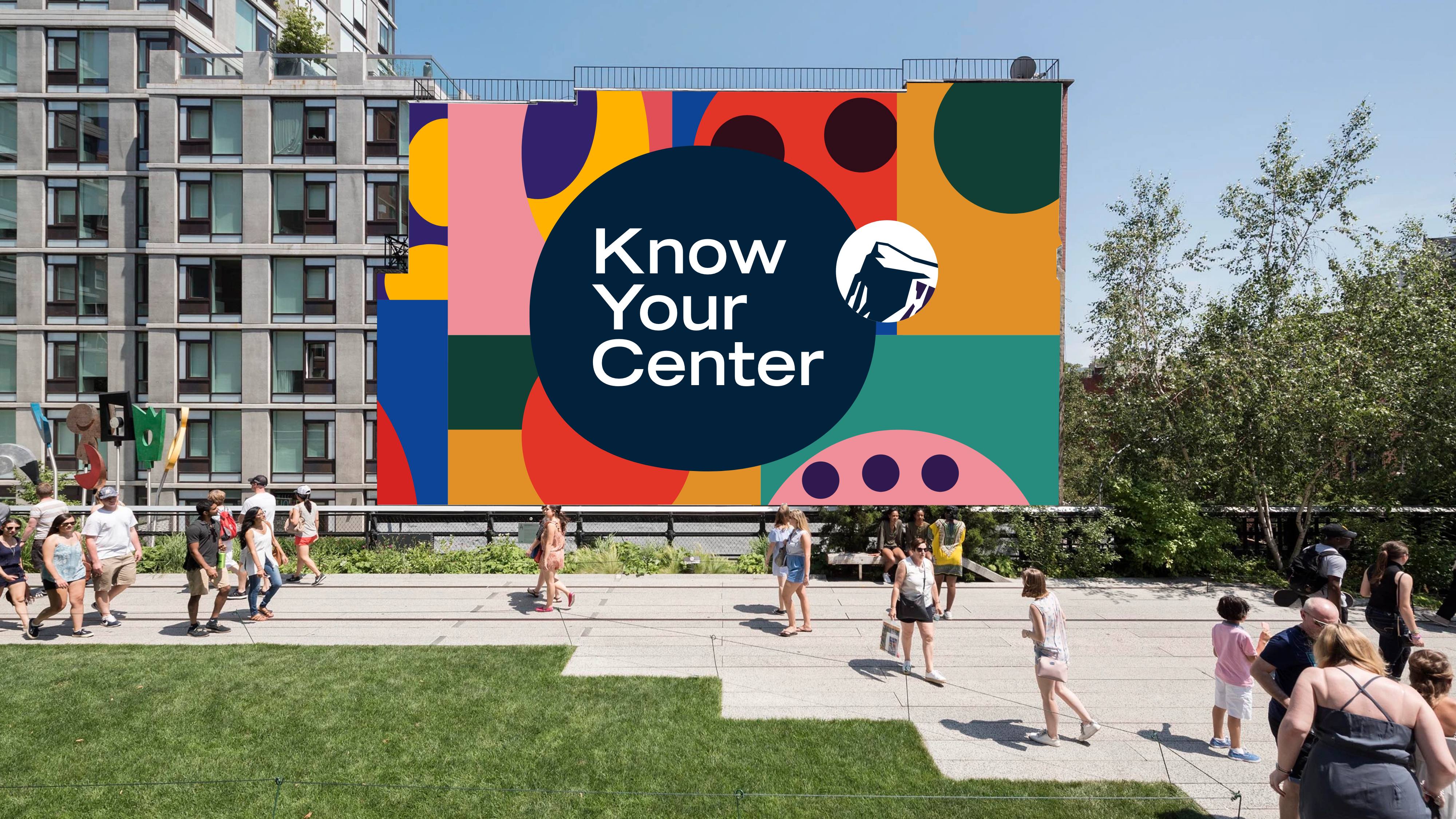
Through the use of murals and wellness-based activation events, this activation Pitch Concept was designed to help Prudential Retirement’s audience see financial wellness as a foundational element in achieving their aspirations and planning for the future.
By posing the question—“What’s Your Center?”, the campaign speaks to the audience without being overwhelming. Intentionally leaving “retirement” out of the top line messaging, and focusing on self-improvement and knowing oneself, the campaign attempts to make the conversation more personal and immediate.
“Life is about the choices we make, what we value and who we strive to be. Those priorities make up our core, our center. What we focus on now—the things we choose to pull into our orbit and keep there—can put us on track for the future we want and help us recover when we get knocked off our center. At Prudential, we believe that with the right help, each and every person can build the rock-solid financial core to support their priorities and aspirations for the future. And, it can have a ripple effect on their entire life and the lives of their loved ones.”
The approach plays off the circular rock icon with overlapping circles representing a participant’s core priorities and interests.
Agency: Prudential
Role: Concepting, Art Direction, Design


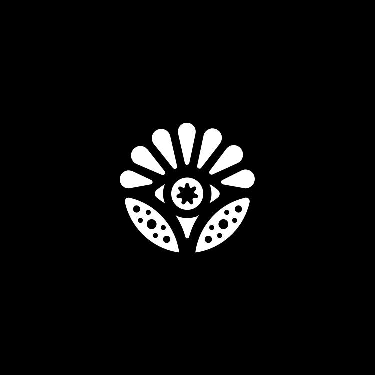
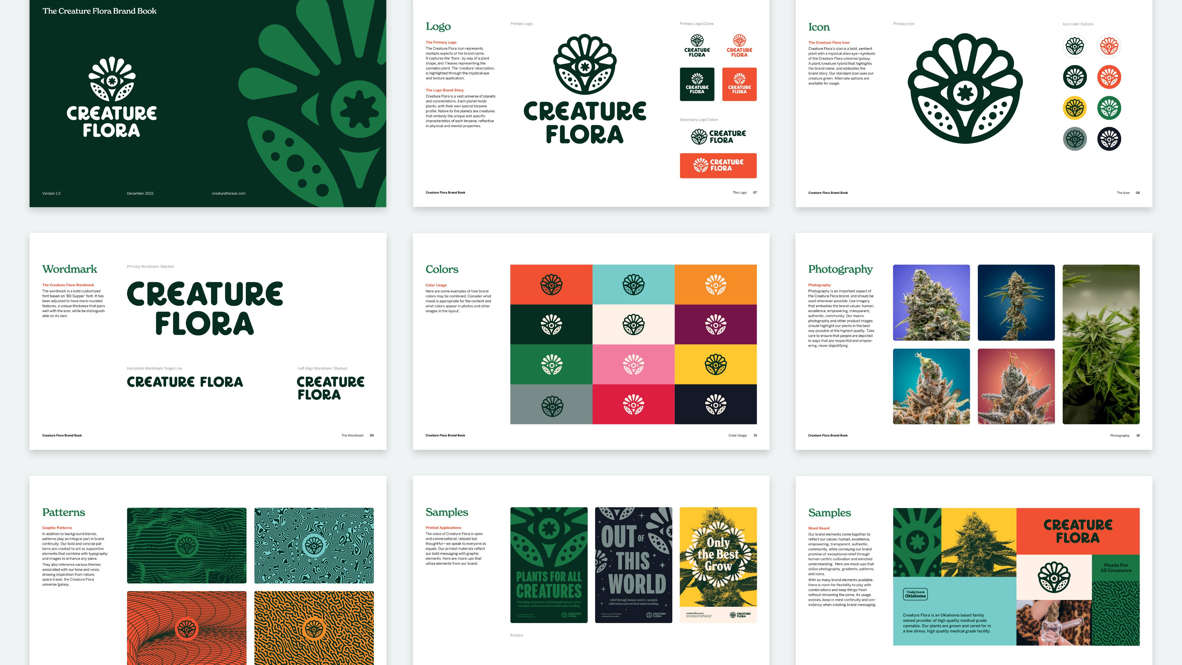
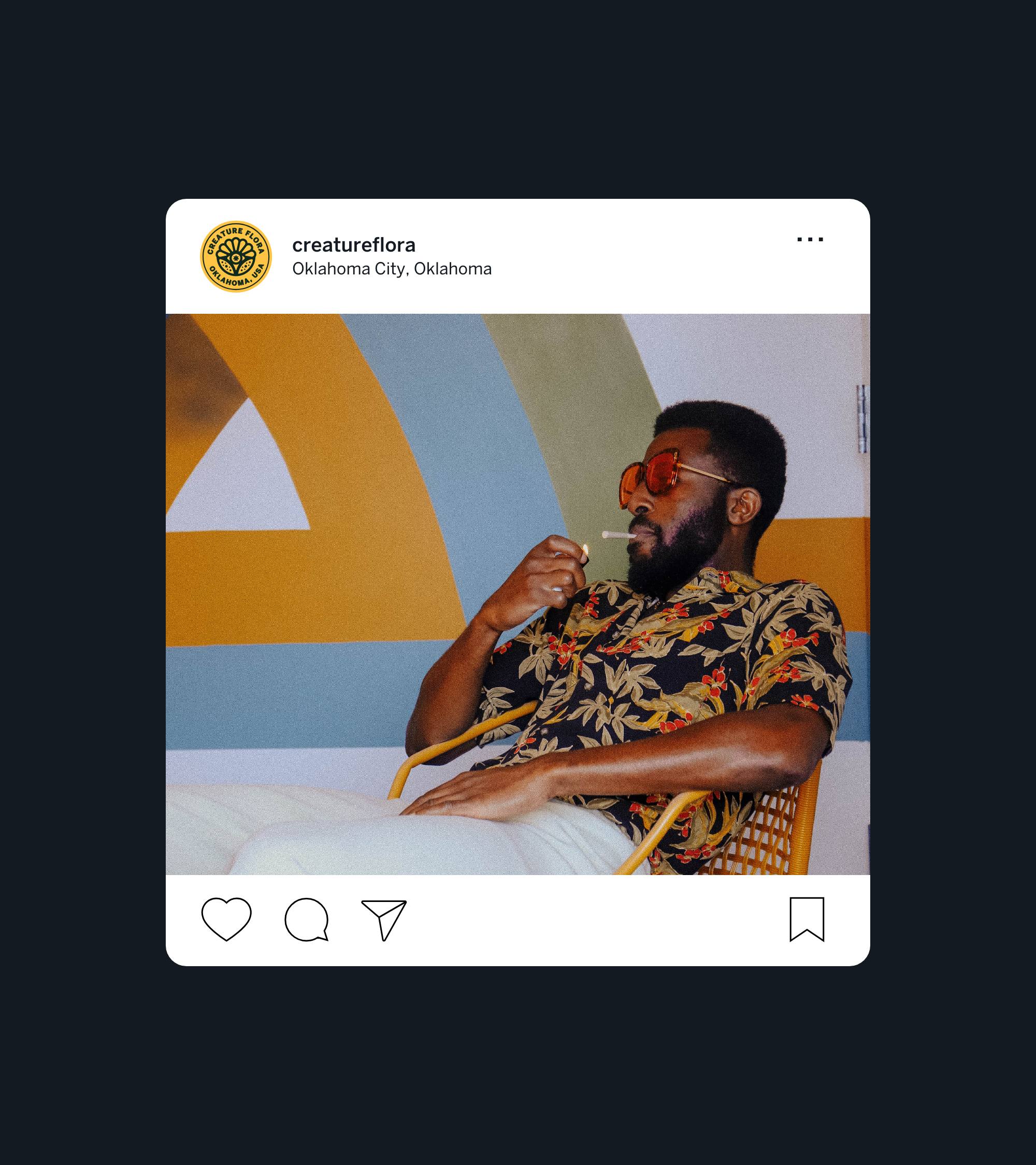
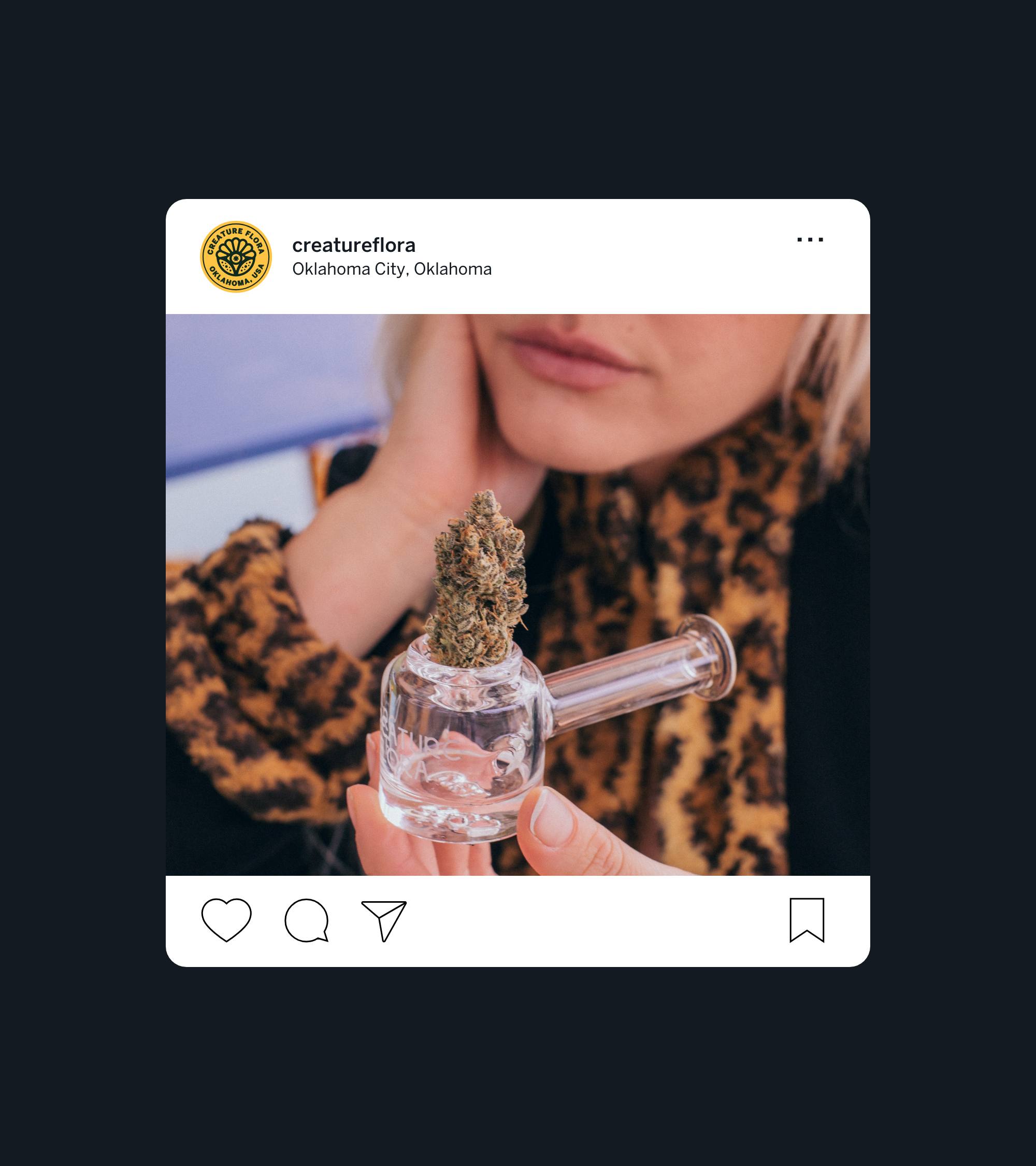
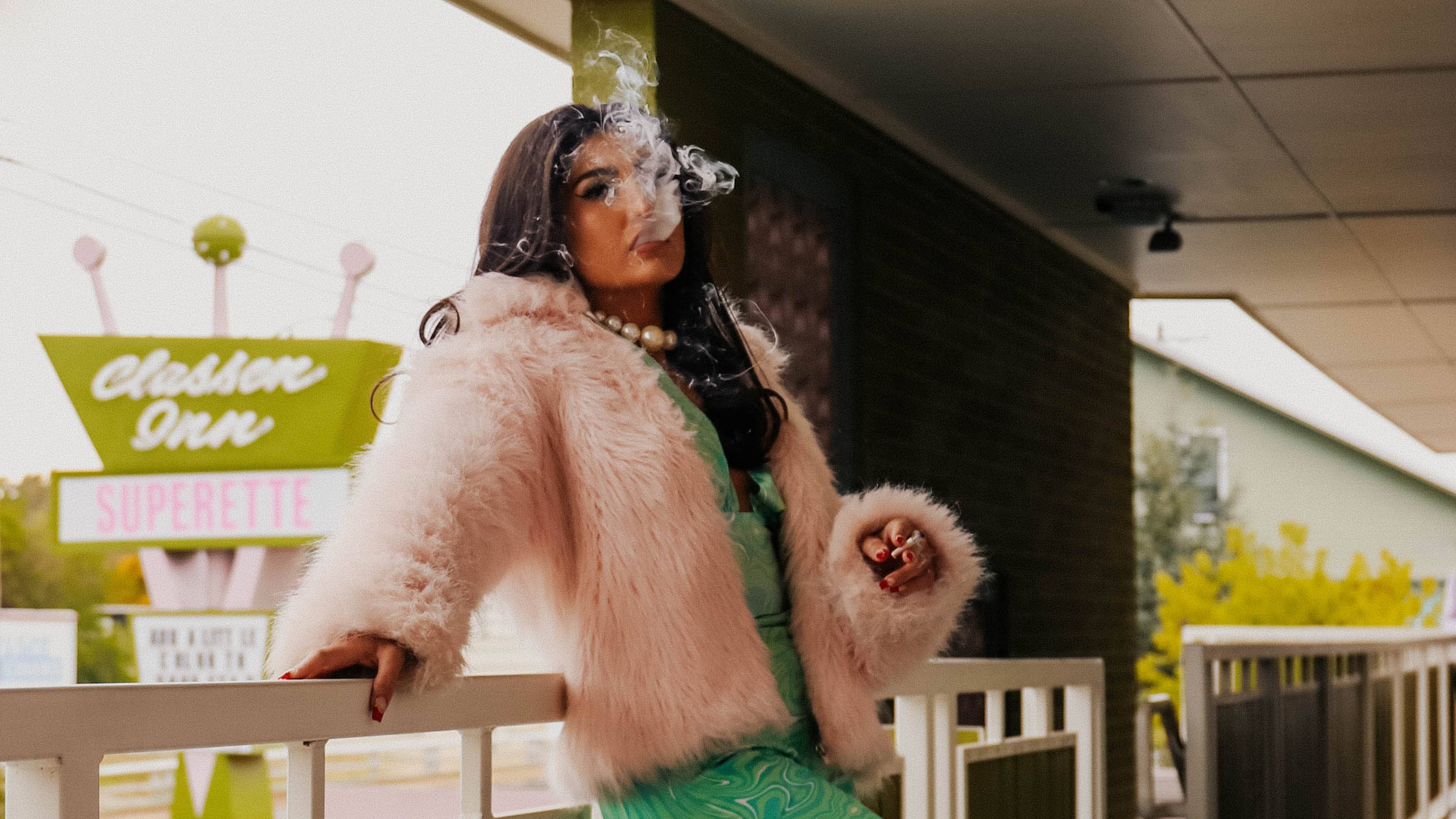
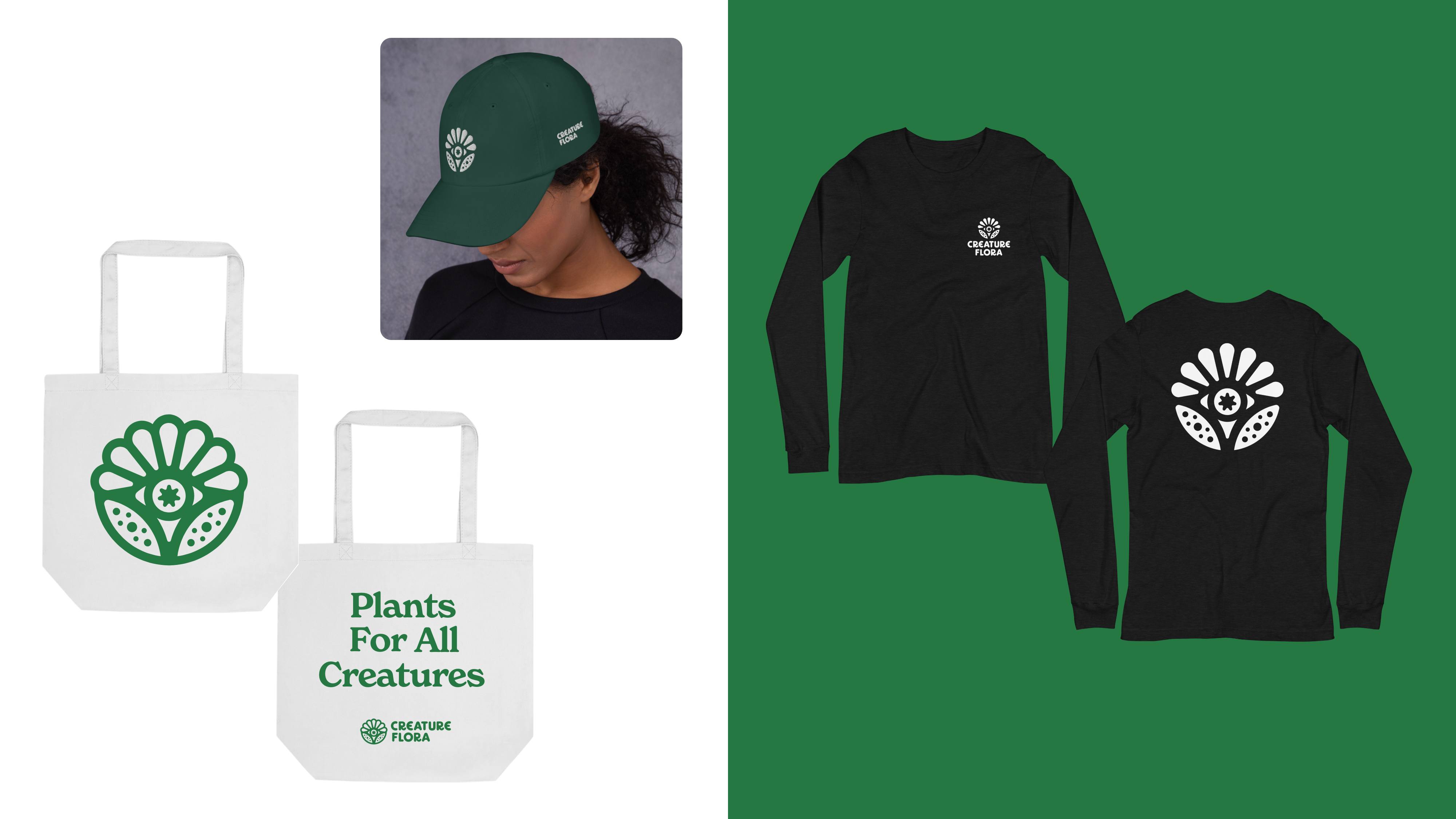
Creature Flora
Brand Identity
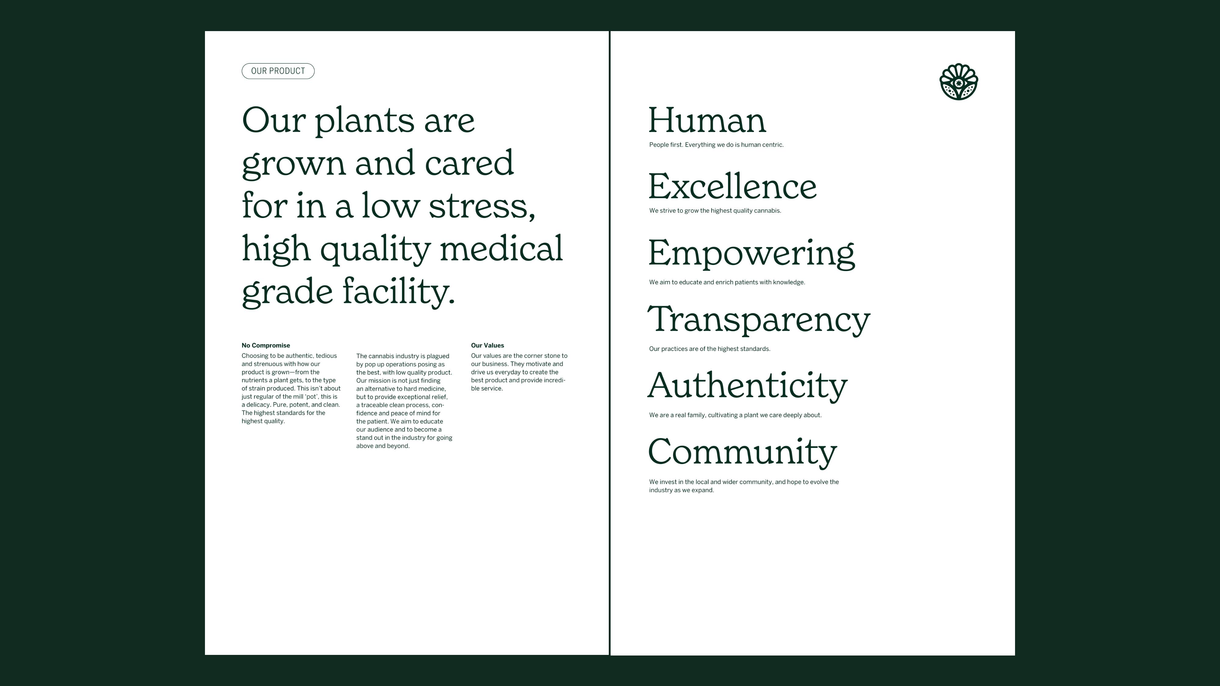
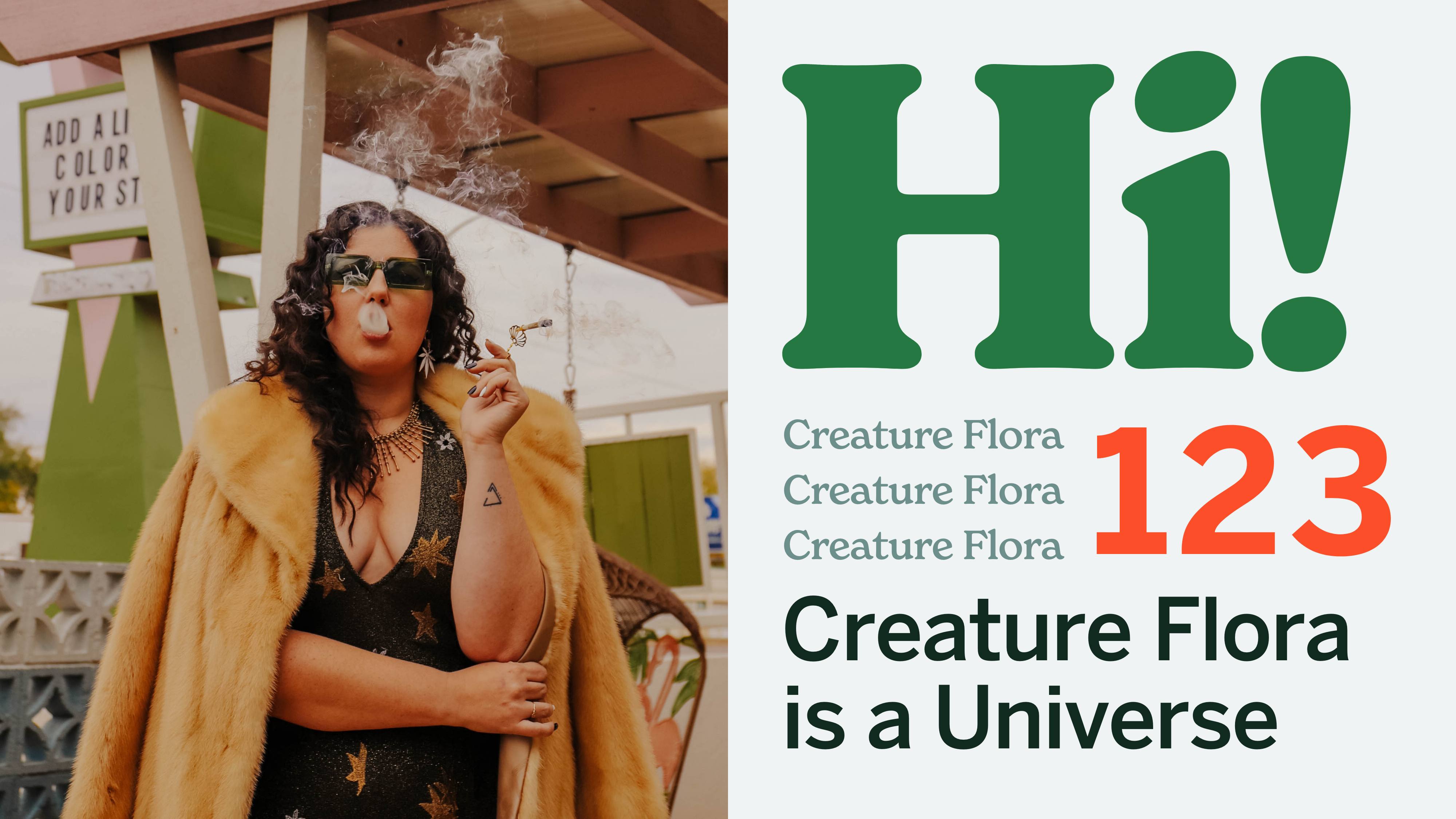
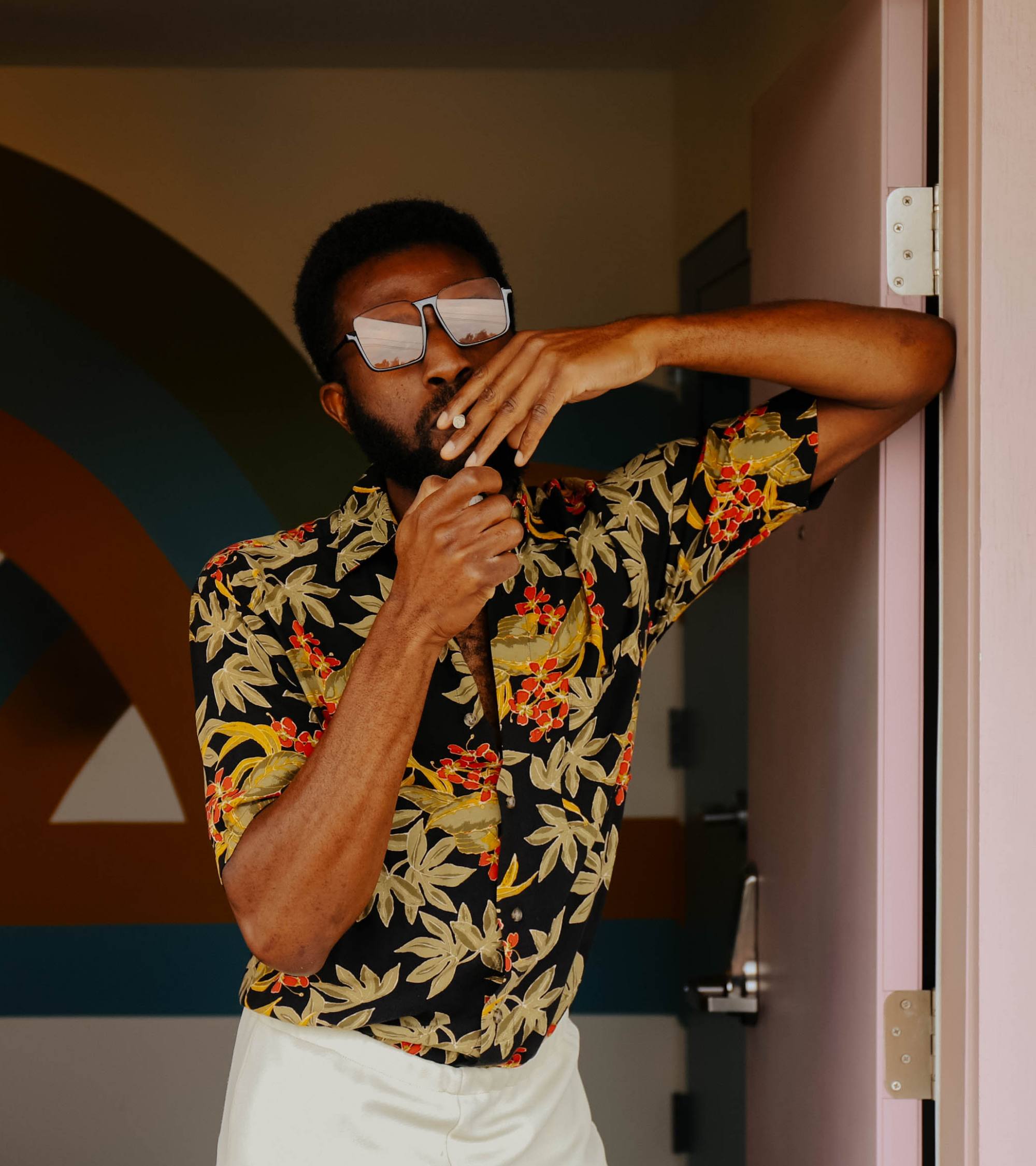
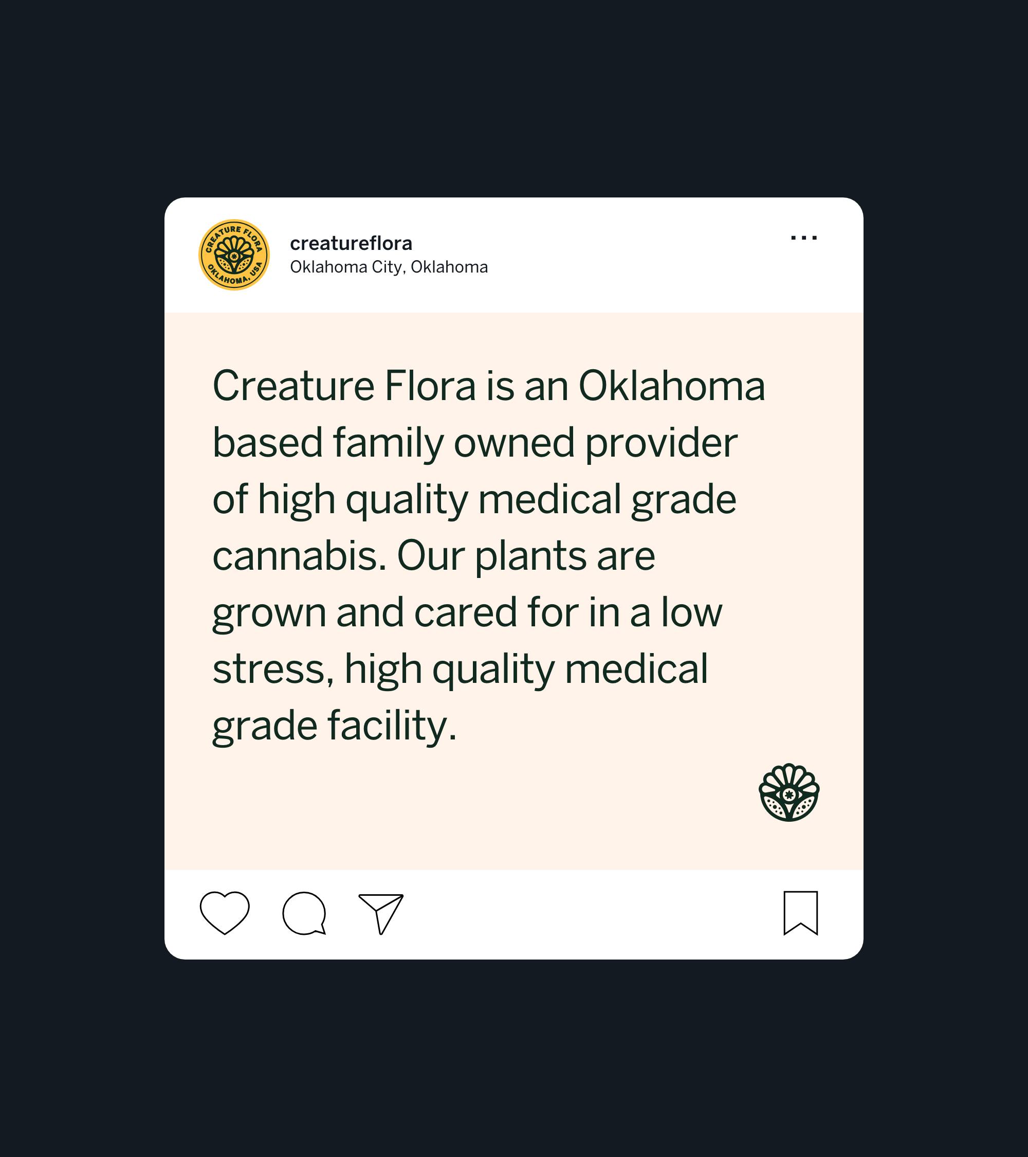
Creature Flora is an Oklahoma based family owned provider of high quality medical grade cannabis. A family business seeking a distinct logo, and brand that can stand out in a highly competitive and crowded industry. The name alone is a unique approach amongst a field of sameness, conjuring sci-fi imagery and other worldliness in an audiences mind. After many conversations with the Creature Flora team - the two themes that stood out were “Creature Flora is a Universe” and “Plants for All Creatures” - the broader ideas for a suite of products, and the core product being high quality and accessible.
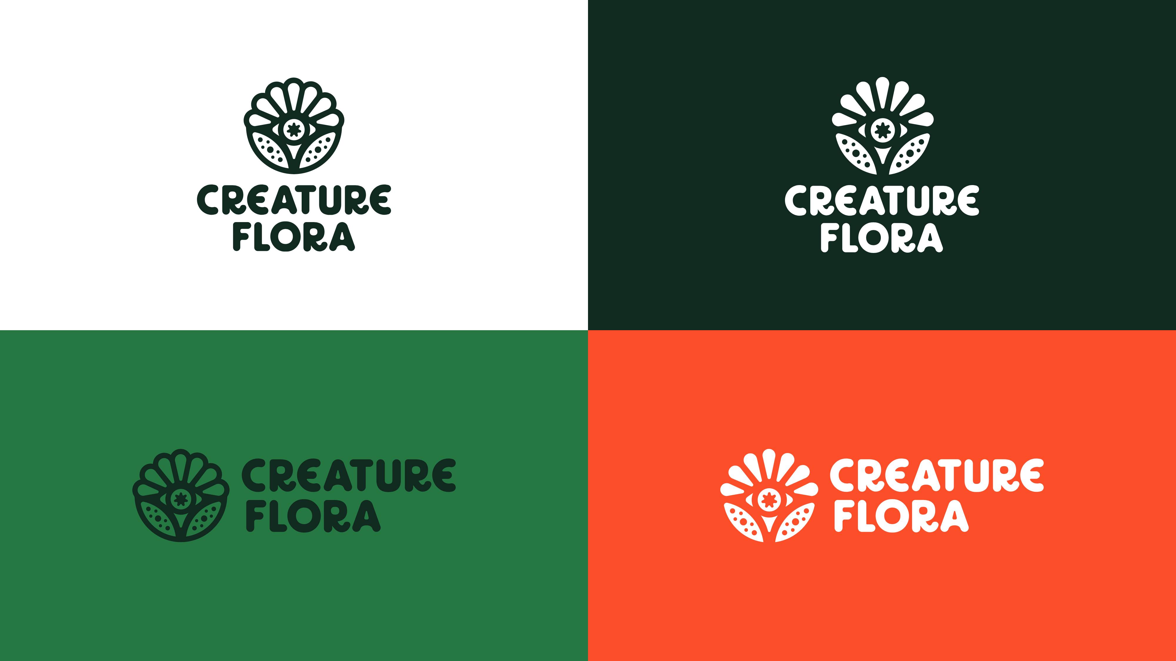
“The Creature Flora icon represents multiple aspects of the brand name. It captures the ‘flora’, by way of a plant shape, and seven leaves representing the cannabis plant. The ‘creature’ description, is highlighted through the mystical eye and textural application.”
With story telling at the core, this bold company is now backed by a bold brand aiming to carve a niche in the cannabis industry.
Agency: MadeOffline
Role: Concepting, Art Direction, Illustration, Design
Photography: Jessi Chapman, Harlee Case
Macro Photography: Rhys Harper


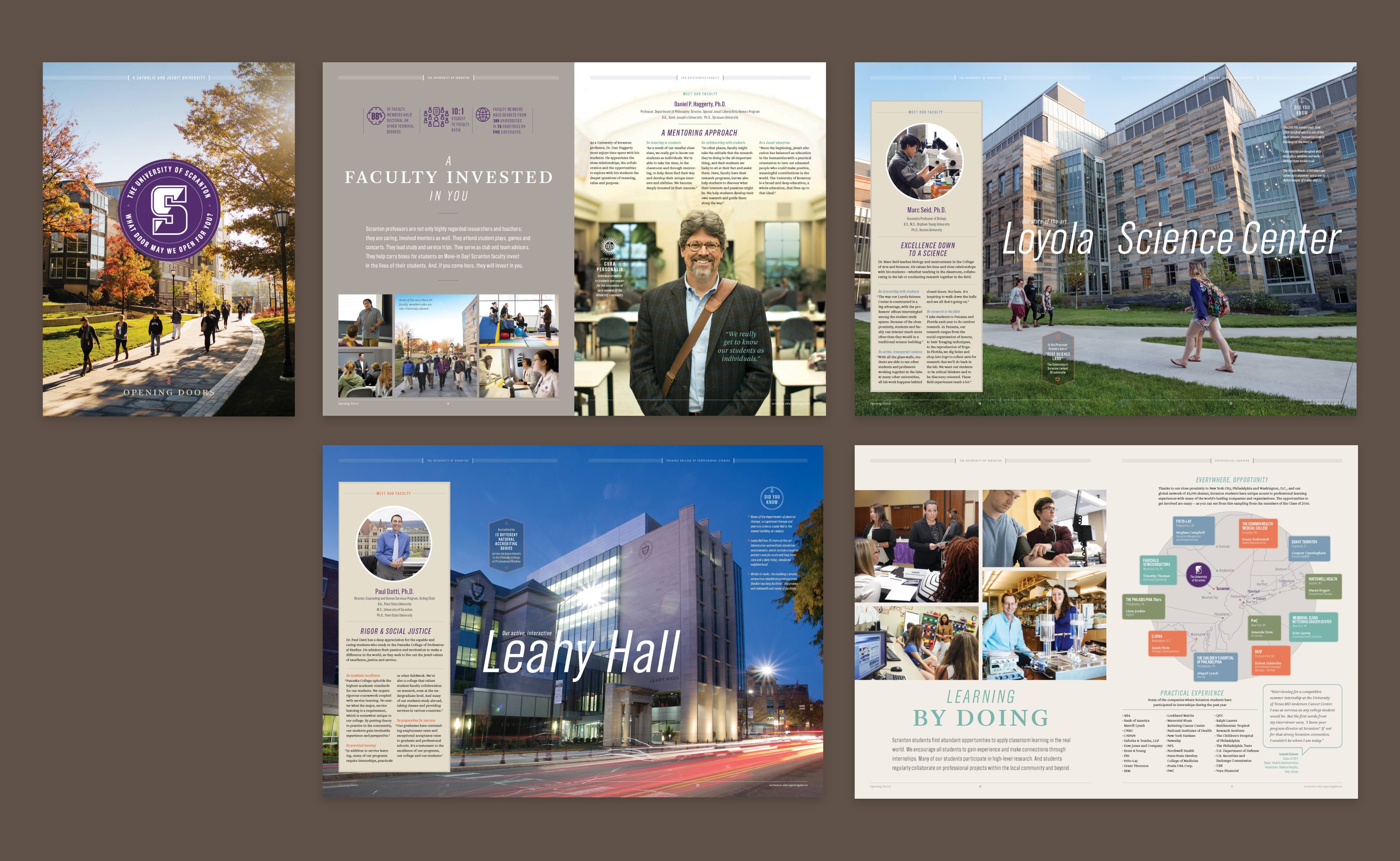
University
of Scranton
Founded in 1888, Scranton is a private Catholic and Jesuit university that is known for outstanding academic quality, a beautiful and technology-rich campus, and a sense of community that helps a student feel right at home. This campaign rebooted the schools u
ndergrad admissions materials look and feel. The campaign positioning tagline was/is “Opening Doors” with the ultimate goal of attracting great students, but also show the location in a better light and combat the negative perception of Scranton, Pennsylvania.
“It might take you aback at first—this tradition of opening doors. Here, at The University of Scranton, it is a custom, and a courtesy, you’ll often observe across our campus. “Opening doors” speaks to our close community—but even more it is a reminder of the immense opportunities, and bright futures, that await all who come here. Inspiring and purposeful, rigorous and transformative, this is an education that will open doors for a lifetime.”
The campaign rollout was all encompassing, starting with a foldout informational piece, then the viewbook, website updates and billboards in target markets.
Agency: TaylorDesign
Writer: Scott Suhr
Role: Concepting, Design, Illustration, Strategy, Campaign Guidelines


Icons &
Logo Marks
Simplicity enables brands to cut through the noise of their industries. Logo creation is challenging in that regard—condensing ideas and ideals into a clear mark, that communicates on many levels. Simple is not easy, it is a process of discovery and experimenting, failing and winning. Here are a selection of logos, icons and marks created for clients in varying industries, that embody the process and generated bold returns.